
鸿蒙HarmonyOS ArkTS电商首页布局实战学习指南
项目演示
一、引言
1.1 鸿蒙HarmonyOS概述
HarmonyOS是华为公司自主研发的分布式操作系统,旨在为多种设备提供统一的操作系统体验。自HarmonyOS NEXT发布以来,其原生开发方式ArkTS(Ark TypeScript)成为开发者关注的焦点。ArkTS是一种基于TypeScript扩展的声明式UI开发语言,结合了TypeScript的类型安全和声明式UI的简洁高效。
1.2 ArkTS简介
ArkTS是HarmonyOS NEXT的主力开发语言,它在TypeScript的基础上扩展了声明式UI语法,引入了装饰器(Decorator)、状态管理、组件化开发等特性。ArkTS支持编译时类型检查,能够在开发阶段发现潜在的错误,提高代码的可靠性和可维护性。
1.3 电商首页布局的重要性
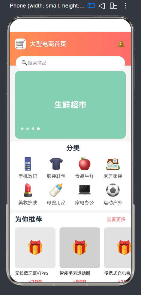
电商首页是用户进入商城的第一入口,其布局设计直接影响用户体验和转化率。一个优秀的电商首页通常包含以下核心模块:
- 轮播图(Banner):展示促销活动、新品发布等重要信息
- 分类导航(Category):帮助用户快速找到目标商品类别
- 推荐商品(Recommend):基于用户行为推荐个性化商品
- 瀑布流商品列表(WaterFlow):以视觉吸引力强的方式展示大量商品
1.4 本文学习目标
通过本文的学习,您将掌握:
- ArkTS声明式UI的基本概念和语法
- 常用布局组件的使用方法(Column、Row、Stack、Grid、Scroll)
- Swiper轮播组件的配置和自定义
- @Builder装饰器的应用技巧
- @State状态管理机制
- 响应式数据绑定和列表渲染
- 渐变背景、圆角、阴影等样式实现
- 电商首页多模块组合布局的最佳实践
二、开发环境准备
2.1 环境要求
在开始开发之前,需要准备以下环境:
- DevEco Studio:HarmonyOS官方IDE,版本建议4.1及以上
- Node.js:版本18.x或更高
- HarmonyOS SDK:API 24及以上版本
- TypeScript:ArkTS基于TypeScript,了解基础语法有助于快速上手
2.2 创建新项目
- 打开DevEco Studio,点击"Create New Project"
- 选择"Empty Ability"模板
- 填写项目名称(如"ECommerceDemo")
- 选择API版本为24
- 点击"Finish"完成项目创建
2.3 项目结构解析
创建完成后,项目结构如下:
ECommerceDemo/
├── AppScope/                    # 应用全局配置
│   ├── resources/               # 全局资源文件
│   └── app.json5               # 应用配置文件
├── entry/                       # 主模块
│   ├── src/
│   │   ├── main/
│   │   │   ├── ets/            # ArkTS代码目录
│   │   │   │   ├── entryability/  # 应用入口
│   │   │   │   └── pages/       # 页面目录
│   │   │   │       └── Index.ets  # 主页面
│   │   │   └── resources/      # 模块资源文件
│   │   └── ohosTest/           # 测试代码
│   ├── build-profile.json5     # 构建配置
│   ├── hvigorfile.ts           # 构建脚本
│   └── oh-package.json5        # 依赖配置
├── hvigor/                     # 构建系统配置
├── build-profile.json5         # 项目构建配置
└── hvigorfile.ts               # 项目构建脚本
三、电商首页布局整体架构
3.1 布局结构设计
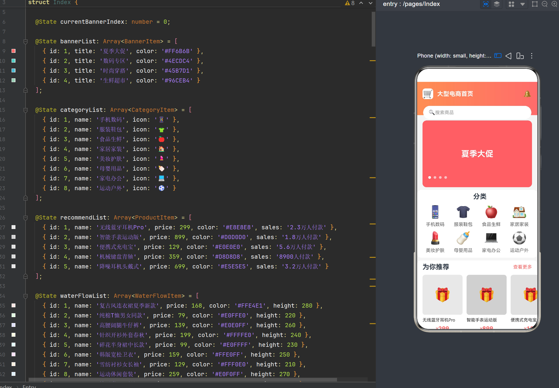
电商首页采用模块化设计,从上到下依次包含:
- 顶部搜索栏区域:包含Logo、标题、通知图标和搜索输入框
- 轮播图区域:自动轮播的Banner展示
- 分类导航区域:网格布局的分类入口
- 推荐商品区域:横向滚动的商品推荐列表
- 瀑布流商品区域:双列瀑布流布局的商品展示
3.2 布局组件层次
Column (根容器)
├── Stack (顶部搜索栏)
│   ├── Column (渐变背景)
│   └── Column (搜索栏内容)
│       ├── SearchBarBuilder
│       └── 搜索输入框
└── Scroll (主内容区域)
    └── Column
        ├── BannerBuilder (轮播图)
        ├── CategoryBuilder (分类)
        ├── RecommendBuilder (推荐)
        └── WaterFlowBuilder (瀑布流)
3.3 数据模型设计
为了支持响应式数据绑定,需要定义以下数据接口:
interface BannerItem {
  id: number;
  title: string;
  color: string;
}

interface CategoryItem {
  id: number;
  name: string;
  icon: string;
}

interface ProductItem {
  id: number;
  name: string;
  price: number;
  color: string;
  sales: string;
}

interface WaterFlowItem {
  id: number;
  name: string;
  price: number;
  color: string;
  height: number;
}
四、ArkTS核心概念详解
4.1 @Entry装饰器
@Entry装饰器用于标记应用的入口组件,每个应用只能有一个@Entry装饰的组件。该组件会作为应用的根组件被渲染。
@Entry
@Component
struct Index {
  build() {
    Column() {
      Text('Hello World')
    }
  }
}
4.2 @Component装饰器
@Component装饰器用于定义自定义组件,是ArkTS声明式UI的基础。组件可以包含状态变量、方法和build方法。
@Component
struct MyComponent {
  @State message: string = 'Hello';

  build() {
    Text(this.message)
      .fontSize(20)
  }
}
4.3 @State状态管理
@State装饰器用于声明组件的内部状态。当状态值发生变化时,框架会自动触发组件的重新渲染。
@State count: number = 0;

// 修改状态会触发UI更新
this.count++;
4.4 @Builder装饰器
@Builder装饰器用于定义可复用的UI片段,可以在组件内部多次调用,降低代码重复率。
@Builder
CustomButton(text: string) {
  Button(text)
    .width(100)
    .height(40)
    .backgroundColor('#FF6B6B')
}

// 在build方法中调用
build() {
  Column() {
    this.CustomButton('确定')
    this.CustomButton('取消')
  }
}
4.5 build方法
build方法是组件的核心渲染方法,返回组件的UI结构。在build方法中只能使用声明式UI语法,不能包含业务逻辑。
build() {
  Column() {
    Text('标题')
      .fontSize(24)
      .fontWeight(FontWeight.Bold)
    Row() {
      Button('点击')
        .onClick(() => {
          // 事件处理逻辑
        })
    }
  }
}
五、顶部搜索栏实现
5.1 布局设计
顶部搜索栏采用Stack组件实现叠加效果,底层是渐变背景,上层是搜索栏内容。
Stack() {
  // 渐变背景
  Column()
    .width('100%')
    .height(100)
    .linearGradient({
      colors: [['#FF6B6B', 0], ['#FF8E53', 1]],
      direction: GradientDirection.Left
    })

  // 搜索栏内容
  Column() {
    this.SearchBarBuilder()
    // 搜索输入框
    Row() {
      Text('🔍')
        .fontSize(16)
      Text('搜索商品')
        .fontSize(14)
        .fontColor('#999999')
    }
    .width('90%')
    .height(40)
    .backgroundColor('#FFFFFF')
    .borderRadius(20)
    .padding({ left: 16 })
    .alignItems(VerticalAlign.Center)
    .margin({ top: 8 })
  }
  .width('100%')
  .padding({ top: 8 })
}
.width('100%')
.height(100)
5.2 linearGradient渐变修饰符
linearGradient是一个样式修饰符,用于创建线性渐变背景。它接受一个配置对象,包含以下属性:
- colors:颜色数组,每个元素是一个包含颜色值和位置的数组
- direction:渐变方向,可选值包括
GradientDirection.Left、GradientDirection.Right、GradientDirection.Top、GradientDirection.Bottom
.linearGradient({
  colors: [['#FF6B6B', 0], ['#FF8E53', 1]],  // 颜色从红色渐变到橙色
  direction: GradientDirection.Left            // 从左向右渐变
})
5.3 SearchBarBuilder实现
搜索栏内部包含Logo、标题和通知图标,使用Row组件进行水平排列。
@Builder
SearchBarBuilder() {
  Row({ space: 12 }) {
    // Logo
    Column() {
      Text('🛒')
        .fontSize(24)
    }
    .width(32)
    .height(32)
    .borderRadius(8)
    .backgroundColor('#FFFFFF')
    .justifyContent(FlexAlign.Center)
    .alignItems(HorizontalAlign.Center)

    // 标题
    Column() {
      Text('大型电商首页')
        .fontSize(18)
        .fontWeight(FontWeight.Bold)
        .fontColor('#FFFFFF')
    }

    // 占位符,将通知图标推到右侧
    Blank()

    // 通知图标
    Column() {
      Text('🔔')
        .fontSize(20)
    }
    .width(28)
    .height(28)
    .justifyContent(FlexAlign.Center)
    .alignItems(HorizontalAlign.Center)
  }
  .width('100%')
  .height(56)
  .padding({ left: 16, right: 16 })
  .alignItems(VerticalAlign.Center)
}
5.4 关键组件解析
Row组件
Row组件用于水平排列子组件,支持以下属性:
- space:子组件之间的间距
- width:宽度
- height:高度
- padding:内边距
- alignItems:垂直对齐方式
Column组件
Column组件用于垂直排列子组件,属性与Row类似:
- space:子组件之间的间距
- width:宽度
- height:高度
- padding:内边距
- justifyContent:水平对齐方式
Blank组件
Blank组件是一个占位符,会占据剩余空间,常用于将组件推到容器的一端。
六、轮播图组件详解
6.1 Swiper组件基础
Swiper是HarmonyOS提供的轮播组件,支持自动播放、指示器、手势滑动等功能。
Swiper(this.swiperController) {
  // 轮播内容
}
.width('100%')
.height(200)
.autoPlay(true)
.interval(3000)
.indicator(true)
6.2 SwiperController控制器
SwiperController用于手动控制轮播,如切换到指定页面、暂停/恢复自动播放等。
private swiperController: SwiperController = new SwiperController();

// 跳转到指定索引
this.swiperController.showNext();
this.swiperController.showPrevious();
this.swiperController.showIndex(2);
6.3 BannerBuilder实现
轮播图模块包含4个Banner,每个Banner使用不同的背景色和标题。
@Builder
BannerBuilder() {
  Column() {
    Swiper(this.swiperController) {
      ForEach(this.bannerList, (item: BannerItem) => {
        Column() {
          Text(item.title)
            .fontSize(24)
            .fontWeight(FontWeight.Bold)
            .fontColor('#FFFFFF')
        }
        .width('100%')
        .height(200)
        .borderRadius(12)
        .backgroundColor(item.color)
        .justifyContent(FlexAlign.Center)
      }, (item: BannerItem) => item.id.toString())
    }
    .width('100%')
    .height(200)
    .autoPlay(true)
    .interval(3000)
    .indicator(true)
    .indicatorStyle({
      left: 0,
      right: 0,
      bottom: 12,
      size: 8,
      color: 'rgba(255,255,255,0.6)',
      selectedColor: '#FFFFFF',
      borderRadius: 4
    })
    .curve(Curve.EaseOut)
    .onChange((index: number) => {
      this.currentBannerIndex = index;
    })
  }
  .padding({ left: 16, right: 16, top: 16 })
}
6.4 ForEach列表渲染
ForEach是ArkTS的列表渲染组件,用于根据数据数组动态生成组件。
ForEach(
  this.bannerList,                    // 数据源
  (item: BannerItem) => {             // 渲染函数
    Column() { ... }
  },
  (item: BannerItem) => item.id.toString()  // 唯一标识函数
)
6.5 indicatorStyle自定义指示器
indicatorStyle用于自定义轮播指示器的样式:
- left/right/bottom:指示器位置
- size:指示器圆点大小
- color:未选中状态颜色
- selectedColor:选中状态颜色
- borderRadius:圆角大小
6.6 轮播数据模型
@State bannerList: Array<BannerItem> = [
  { id: 1, title: '夏季大促', color: '#FF6B6B' },
  { id: 2, title: '数码专区', color: '#4ECDC4' },
  { id: 3, title: '时尚穿搭', color: '#45B7D1' },
  { id: 4, title: '生鲜超市', color: '#96CEB4' }
];
七、分类网格布局
7.1 Grid组件基础
Grid组件用于创建网格布局,支持自定义行列数量和间距。
Grid() {
  GridItem() {
    // 网格项内容
  }
}
.width('100%')
.height(160)
.columnsTemplate('1fr 1fr 1fr 1fr')  // 4列
.rowsTemplate('1fr 1fr')              // 2行
.columnsGap(8)                        // 列间距
.rowsGap(8)                           // 行间距
7.2 CategoryBuilder实现
分类模块包含8个分类项,采用2行4列的网格布局。
@Builder
CategoryBuilder() {
  Column() {
    // 标题
    Text('分类')
      .fontSize(20)
      .fontWeight(FontWeight.Bold)
      .padding({ left: 16, top: 8 })

    // 网格布局
    Grid() {
      ForEach(this.categoryList, (item: CategoryItem) => {
        GridItem() {
          Column({ space: 8 }) {
            Text(item.icon)
              .fontSize(36)
            Text(item.name)
              .fontSize(14)
              .fontColor('#666666')
          }
          .width('100%')
          .height('100%')
          .justifyContent(FlexAlign.Center)
        }
      }, (item: CategoryItem) => item.id.toString())
    }
    .width('100%')
    .height(160)
    .columnsTemplate('1fr 1fr 1fr 1fr')
    .rowsTemplate('1fr 1fr')
    .columnsGap(8)
    .rowsGap(8)
    .padding({ left: 16, right: 16, top: 12 })
  }
  .backgroundColor('#FFFFFF')
  .margin({ top: 8 })
  .borderRadius(12)
  .padding({ bottom: 12 })
}
7.3 GridItem组件
GridItem是Grid的子组件,每个GridItem占据一个网格单元。
7.4 分类数据模型
@State categoryList: Array<CategoryItem> = [
  { id: 1, name: '手机数码', icon: '📱' },
  { id: 2, name: '服装鞋包', icon: '👕' },
  { id: 3, name: '食品生鲜', icon: '🍎' },
  { id: 4, name: '家居家装', icon: '🏠' },
  { id: 5, name: '美妆护肤', icon: '💄' },
  { id: 6, name: '母婴用品', icon: '🍼' },
  { id: 7, name: '家电办公', icon: '💻' },
  { id: 8, name: '运动户外', icon: '⚽' }
];
八、推荐商品横滑列表
8.1 横向滚动实现
使用Scroll组件配合scrollable(ScrollDirection.Horizontal)实现横向滚动。
Scroll() {
  Row({ space: 12 }) {
    // 横向排列的商品
  }
}
.scrollBar(BarState.Off)
.scrollable(ScrollDirection.Horizontal)
.width('100%')
.height(180)
8.2 RecommendBuilder实现
推荐模块展示5个商品,支持横向滑动查看更多。
@Builder
RecommendBuilder() {
  Column() {
    // 标题区域
    Row() {
      Text('为你推荐')
        .fontSize(20)
        .fontWeight(FontWeight.Bold)
      Blank()
      Text('查看更多')
        .fontSize(14)
        .fontColor('#FF6B6B')
    }
    .width('100%')
    .padding({ left: 16, right: 16, top: 8 })

    // 横向滚动区域
    Scroll() {
      Row({ space: 12 }) {
        ForEach(this.recommendList, (item: ProductItem) => {
          Column({ space: 8 }) {
            // 商品图片占位
            Column() {
              Text('🎁')
                .fontSize(40)
            }
            .width(120)
            .height(120)
            .borderRadius(8)
            .backgroundColor(item.color)
            .justifyContent(FlexAlign.Center)
            .alignItems(HorizontalAlign.Center)

            // 商品名称
            Text(item.name)
              .fontSize(13)
              .fontColor('#333333')
              .maxLines(2)
              .width(120)
              .textOverflow({ overflow: TextOverflow.Ellipsis })

            // 商品价格
            Row() {
              Text('¥')
                .fontSize(12)
                .fontColor('#FF6B6B')
              Text(item.price.toString())
                .fontSize(18)
                .fontWeight(FontWeight.Bold)
                .fontColor('#FF6B6B')
            }

            // 销量
            Text(item.sales)
              .fontSize(11)
              .fontColor('#999999')
          }
          .margin({ top: 12 })
        }, (item: ProductItem) => item.id.toString())
      }
      .width('100%')
      .padding({ left: 16 })
    }
    .scrollBar(BarState.Off)
    .scrollable(ScrollDirection.Horizontal)
    .width('100%')
    .height(180)
  }
  .backgroundColor('#FFFFFF')
  .margin({ top: 8 })
  .borderRadius(12)
  .padding({ bottom: 8 })
}
8.3 scrollBar隐藏滚动条
scrollBar(BarState.Off)用于隐藏滚动条,使界面更加整洁。
8.4 textOverflow文本截断
当商品名称过长时,使用textOverflow进行截断处理:
Text(item.name)
  .fontSize(13)
  .fontColor('#333333')
  .maxLines(2)           // 最多显示2行
  .width(120)
  .textOverflow({ overflow: TextOverflow.Ellipsis })  // 超出部分显示省略号
8.5 推荐数据模型
@State recommendList: Array<ProductItem> = [
  { id: 1, name: '无线蓝牙耳机Pro', price: 299, color: '#E8E8E8', sales: '2.3万人付款' },
  { id: 2, name: '智能手表运动版', price: 899, color: '#D0D0D0', sales: '1.8万人付款' },
  { id: 3, name: '便携式充电宝', price: 129, color: '#E0E0E0', sales: '5.6万人付款' },
  { id: 4, name: '机械键盘青轴', price: 359, color: '#D8D8D8', sales: '8900人付款' },
  { id: 5, name: '降噪耳机头戴式', price: 699, color: '#E5E5E5', sales: '3.2万人付款' }
];
九、瀑布流布局实现
9.1 瀑布流原理
瀑布流布局是一种多列不规则排列的布局方式,每个商品卡片的高度不同,能够充分利用空间,视觉效果丰富。
在HarmonyOS中,可以通过以下两种方式实现瀑布流:
- WaterFlow组件(API 9+):系统提供的瀑布流组件
- 手动模拟:使用Row + 两个Column手动实现
由于WaterFlow组件在某些API版本中存在兼容性问题,本文采用手动模拟的方式实现。
9.2 WaterFlowBuilder实现
瀑布流模块包含12个商品,分为两列展示,每列的商品高度不同。
@Builder
WaterFlowBuilder() {
  Column() {
    // 标题区域
    Row() {
      Text('猜你喜欢')
        .fontSize(20)
        .fontWeight(FontWeight.Bold)
      Blank()
      Text('换一批')
        .fontSize(14)
        .fontColor('#FF6B6B')
    }
    .width('100%')
    .padding({ left: 16, right: 16, top: 8 })

    // 双列布局
    Row({ space: 12 }) {
      // 左列 - 偶数索引的商品
      Column() {
        ForEach(this.waterFlowList.filter((_, index) => index % 2 === 0), (item: WaterFlowItem) => {
          Column({ space: 6 }) {
            Column() {
              Text('👗')
                .fontSize(48)
            }
            .width('100%')
            .height(item.height)
            .borderRadius(8)
            .backgroundColor(item.color)
            .justifyContent(FlexAlign.Center)
            .alignItems(HorizontalAlign.Center)

            Text(item.name)
              .fontSize(13)
              .fontColor('#333333')
              .maxLines(2)
              .textOverflow({ overflow: TextOverflow.Ellipsis })

            Row() {
              Text('¥')
                .fontSize(12)
                .fontColor('#FF6B6B')
              Text(item.price.toString())
                .fontSize(16)
                .fontWeight(FontWeight.Bold)
                .fontColor('#FF6B6B')
            }
          }
          .backgroundColor('#FFFFFF')
          .borderRadius(8)
          .padding(6)
          .margin({ top: 12 })
        }, (item: WaterFlowItem) => item.id.toString())
      }
      .width('50%')

      // 右列 - 奇数索引的商品
      Column() {
        ForEach(this.waterFlowList.filter((_, index) => index % 2 === 1), (item: WaterFlowItem) => {
          Column({ space: 6 }) {
            Column() {
              Text('👗')
                .fontSize(48)
            }
            .width('100%')
            .height(item.height)
            .borderRadius(8)
            .backgroundColor(item.color)
            .justifyContent(FlexAlign.Center)
            .alignItems(HorizontalAlign.Center)

            Text(item.name)
              .fontSize(13)
              .fontColor('#333333')
              .maxLines(2)
              .textOverflow({ overflow: TextOverflow.Ellipsis })

            Row() {
              Text('¥')
                .fontSize(12)
                .fontColor('#FF6B6B')
              Text(item.price.toString())
                .fontSize(16)
                .fontWeight(FontWeight.Bold)
                .fontColor('#FF6B6B')
            }
          }
          .backgroundColor('#FFFFFF')
          .borderRadius(8)
          .padding(6)
          .margin({ top: 12 })
        }, (item: WaterFlowItem) => item.id.toString())
      }
      .width('50%')
    }
    .width('100%')
    .padding({ left: 16, right: 16 })
  }
  .margin({ top: 8, bottom: 24 })
}
9.3 filter筛选数据
使用filter方法将商品列表分为两部分:
- 偶数索引(0, 2, 4…)放入左列
- 奇数索引(1, 3, 5…)放入右列
// 左列
this.waterFlowList.filter((_, index) => index % 2 === 0)

// 右列
this.waterFlowList.filter((_, index) => index % 2 === 1)
9.4 瀑布流数据模型
@State waterFlowList: Array<WaterFlowItem> = [
  { id: 1, name: '复古风连衣裙夏季新款', price: 168, color: '#FFE4E1', height: 280 },
  { id: 2, name: '纯棉T恤男女同款', price: 79, color: '#E0FFE0', height: 220 },
  { id: 3, name: '高腰阔腿牛仔裤', price: 139, color: '#E0E0FF', height: 260 },
  { id: 4, name: '针织开衫外套春秋', price: 199, color: '#FFFFE0', height: 240 },
  { id: 5, name: '碎花半身裙中长款', price: 99, color: '#E0FFFF', height: 230 },
  { id: 6, name: '韩版宽松卫衣', price: 159, color: '#FFE0FF', height: 250 },
  { id: 7, name: '雪纺衬衫女长袖', price: 129, color: '#FFF0E0', height: 210 },
  { id: 8, name: '运动休闲套装', price: 259, color: '#E0F0FF', height: 270 },
  { id: 9, name: '波西米亚风长裙', price: 189, color: '#F0E0FF', height: 290 },
  { id: 10, name: '牛仔外套女短款', price: 179, color: '#F0FFE0', height: 240 },
  { id: 11, name: '甜美公主裙', price: 149, color: '#FFE0E0', height: 260 },
  { id: 12, name: '简约通勤西装', price: 299, color: '#E0E0F0', height: 230 }
];
十、状态管理与数据绑定
10.1 @State响应式机制
@State是ArkTS最基础的状态管理装饰器,当状态值改变时,框架会自动触发UI更新。
@State count: number = 0;

increment() {
  this.count++;  // 触发UI更新
}
10.2 数据绑定语法
在ArkTS中,可以通过{}语法将状态变量绑定到组件属性。
Text(`当前计数: ${this.count}`)
  .fontSize(20)

Button(`点击${this.count}次`)
  .onClick(() => {
    this.count++;
  })
10.3 列表数据绑定
对于列表数据,使用ForEach进行动态渲染:
ForEach(this.bannerList, (item) => {
  Column() {
    Text(item.title)
  }
  .backgroundColor(item.color)
}, (item) => item.id.toString())
10.4 状态更新时机
ArkTS的状态更新是异步的,框架会在适当的时机批量更新UI,避免频繁渲染。
十一、@Builder装饰器的使用技巧
11.1 组件拆分原则
使用@Builder可以将复杂的UI拆分为多个独立的片段,提高代码的可读性和复用性。
拆分原则:
- 每个Builder只负责一个功能模块
- Builder之间相互独立,不依赖外部状态
- 通过参数传递数据
11.2 Builder参数传递
Builder可以接受参数,实现更灵活的复用。
@Builder
ProductCard(item: ProductItem) {
  Column({ space: 8 }) {
    Column() {
      Text('🎁')
        .fontSize(40)
    }
    .width(120)
    .height(120)
    .backgroundColor(item.color)

    Text(item.name)
      .fontSize(13)
  }
}

// 使用时传递参数
this.ProductCard(item)
11.3 Builder嵌套调用
Builder可以嵌套调用其他Builder,形成层次结构。
@Builder
Header() {
  Row() {
    this.Logo()
    this.Title()
    this.NotificationIcon()
  }
}

@Builder
Logo() {
  Text('🛒')
    .fontSize(24)
}

@Builder
Title() {
  Text('大型电商首页')
    .fontSize(18)
}

@Builder
NotificationIcon() {
  Text('🔔')
    .fontSize(20)
}
十二、样式与主题
12.1 颜色系统
ArkTS支持多种颜色表示方式:
- 十六进制:
#FF6B6B - RGB/RGBA:
rgb(255, 107, 107)、rgba(255, 107, 107, 0.5) - 颜色资源:
$r('app.color.primary_color')
12.2 字体样式
Text('标题')
  .fontSize(20)           // 字体大小
  .fontWeight(FontWeight.Bold)  // 字体粗细
  .fontColor('#333333')   // 字体颜色
  .fontFamily('HarmonyOS Sans')  // 字体家族
12.3 边框与圆角
Column()
  .borderWidth(1)         // 边框宽度
  .borderColor('#EEEEEE') // 边框颜色
  .borderRadius(12)       // 圆角大小
  .borderStyle(BorderStyle.Solid)  // 边框样式
12.4 内边距与外边距
Column()
  .padding({ left: 16, right: 16, top: 8, bottom: 8 })  // 内边距
  .margin({ top: 8, bottom: 12 })                        // 外边距
12.5 背景样式
Column()
  .backgroundColor('#FFFFFF')  // 纯色背景
  .linearGradient({ ... })     // 渐变背景
十三、性能优化
13.1 列表渲染优化
对于大量数据的列表,需要注意以下优化点:
- 使用ForEach的第三个参数:提供唯一标识函数,帮助框架识别列表项的变化
- 避免嵌套ForEach:嵌套ForEach会导致性能下降
- 使用懒加载:对于超长列表,考虑使用
LazyForEach
13.2 组件复用
通过@Builder将重复的UI片段提取为可复用的组件,减少代码冗余。
13.3 避免不必要的状态更新
只在必要时更新状态,避免频繁的状态变更导致UI反复渲染。
13.4 图片优化
如果使用网络图片,需要注意:
- 使用合适的图片尺寸
- 实现图片缓存
- 添加图片加载占位符
十四、完整代码解析
14.1 代码结构概览
@Entry
@Component
struct Index {
  // 1. 状态变量和数据模型
  private swiperController: SwiperController = new SwiperController();
  @State currentBannerIndex: number = 0;
  @State bannerList: Array<BannerItem> = [...];
  @State categoryList: Array<CategoryItem> = [...];
  @State recommendList: Array<ProductItem> = [...];
  @State waterFlowList: Array<WaterFlowItem> = [...];

  // 2. Builder方法
  @Builder BannerBuilder() { ... }
  @Builder CategoryBuilder() { ... }
  @Builder RecommendBuilder() { ... }
  @Builder WaterFlowBuilder() { ... }
  @Builder SearchBarBuilder() { ... }

  // 3. 主构建方法
  build() {
    Column() {
      // 顶部搜索栏
      Stack() { ... }

      // 主内容区域
      Scroll() {
        Column() {
          this.BannerBuilder()
          this.CategoryBuilder()
          this.RecommendBuilder()
          this.WaterFlowBuilder()
        }
      }
    }
  }
}

// 4. 接口定义
interface BannerItem { ... }
interface CategoryItem { ... }
interface ProductItem { ... }
interface WaterFlowItem { ... }
14.2 关键代码详解
主构建方法
build() {
  Column() {
    // 顶部搜索栏区域
    Stack() {
      // 渐变背景
      Column()
        .width('100%')
        .height(100)
        .linearGradient({
          colors: [['#FF6B6B', 0], ['#FF8E53', 1]],
          direction: GradientDirection.Left
        })

      // 搜索栏内容
      Column() {
        this.SearchBarBuilder()
        Row() {
          Text('🔍')
            .fontSize(16)
          Text('搜索商品')
            .fontSize(14)
            .fontColor('#999999')
        }
        .width('90%')
        .height(40)
        .backgroundColor('#FFFFFF')
        .borderRadius(20)
        .padding({ left: 16 })
        .alignItems(VerticalAlign.Center)
        .margin({ top: 8 })
      }
      .width('100%')
      .padding({ top: 8 })
    }
    .width('100%')
    .height(100)

    // 主内容区域 - 可滚动
    Scroll() {
      Column() {
        this.BannerBuilder()
        this.CategoryBuilder()
        this.RecommendBuilder()
        this.WaterFlowBuilder()
      }
      .width('100%')
    }
    .scrollBar(BarState.Off)
    .scrollable(ScrollDirection.Vertical)
    .width('100%')
    .flexGrow(1)
  }
  .width('100%')
  .height('100%')
  .backgroundColor('#F5F5F5')
}
flexGrow属性
flexGrow(1)用于让Scroll组件占据剩余空间,实现自适应布局。
十五、常见问题与解决方案
15.1 Swiper指示器样式错误
问题:indicatorStyle中使用了不支持的属性(如padding)
解决方案:移除不支持的属性,只使用框架支持的属性
.indicatorStyle({
  left: 0,
  right: 0,
  bottom: 12,
  size: 8,
  color: 'rgba(255,255,255,0.6)',
  selectedColor: '#FFFFFF',
  borderRadius: 4
  // padding属性不支持,已移除
})
15.2 LinearGradient调用错误
问题:使用LinearGradient({...})组件方式导致语法错误
解决方案:使用.linearGradient({...})修饰符方式
// 错误方式
LinearGradient({
  colors: [['#FF6B6B', 0], ['#FF8E53', 1]],
  direction: GradientDirection.Left
})

// 正确方式
Column()
  .width('100%')
  .height(100)
  .linearGradient({
    colors: [['#FF6B6B', 0], ['#FF8E53', 1]],
    direction: GradientDirection.Left
  })
15.3 WaterFlow组件兼容性问题
问题:WaterFlow和LazyVGridLayout组件在某些API版本中存在兼容性问题
解决方案:使用Row + 两个Column手动模拟瀑布流布局
15.4 滚动冲突问题
问题:Scroll嵌套WaterFlow导致滚动冲突
解决方案:使用手动模拟的瀑布流布局,避免嵌套可滚动组件
十六、总结与展望
16.1 学习总结
通过本文的学习,您已经掌握了以下技能:
- ArkTS声明式UI基础:@Entry、@Component、@State、@Builder等装饰器的使用
- 布局组件:Column、Row、Stack、Grid、Scroll、Swiper等组件的配置和使用
- 样式系统:颜色、字体、边框、圆角、渐变等样式的实现
- 数据绑定:响应式数据绑定和列表渲染
- 电商首页布局:轮播图、分类、推荐、瀑布流四大模块的实现
16.2 最佳实践建议
- 组件化开发:将页面拆分为多个独立的组件,提高代码复用性
- 状态管理:合理使用@State、@Prop、@Link等状态装饰器
- 性能优化:注意列表渲染性能,避免不必要的状态更新
- 代码规范:遵循ArkTS代码规范,使用TypeScript类型系统
16.3 后续学习方向
- 路由导航:学习页面跳转和参数传递
- 网络请求:学习HTTP请求和数据解析
- 本地存储:学习Preferences和数据库操作
- 动画效果:学习属性动画和显式动画
- 自定义组件:学习创建可复用的自定义组件
附录:完整代码
@Entry
@Component
struct Index {
  private swiperController: SwiperController = new SwiperController();

  @State currentBannerIndex: number = 0;

  @State bannerList: Array<BannerItem> = [
    { id: 1, title: '夏季大促', color: '#FF6B6B' },
    { id: 2, title: '数码专区', color: '#4ECDC4' },
    { id: 3, title: '时尚穿搭', color: '#45B7D1' },
    { id: 4, title: '生鲜超市', color: '#96CEB4' }
  ];

  @State categoryList: Array<CategoryItem> = [
    { id: 1, name: '手机数码', icon: '📱' },
    { id: 2, name: '服装鞋包', icon: '👕' },
    { id: 3, name: '食品生鲜', icon: '🍎' },
    { id: 4, name: '家居家装', icon: '🏠' },
    { id: 5, name: '美妆护肤', icon: '💄' },
    { id: 6, name: '母婴用品', icon: '🍼' },
    { id: 7, name: '家电办公', icon: '💻' },
    { id: 8, name: '运动户外', icon: '⚽' }
  ];

  @State recommendList: Array<ProductItem> = [
    { id: 1, name: '无线蓝牙耳机Pro', price: 299, color: '#E8E8E8', sales: '2.3万人付款' },
    { id: 2, name: '智能手表运动版', price: 899, color: '#D0D0D0', sales: '1.8万人付款' },
    { id: 3, name: '便携式充电宝', price: 129, color: '#E0E0E0', sales: '5.6万人付款' },
    { id: 4, name: '机械键盘青轴', price: 359, color: '#D8D8D8', sales: '8900人付款' },
    { id: 5, name: '降噪耳机头戴式', price: 699, color: '#E5E5E5', sales: '3.2万人付款' }
  ];

  @State waterFlowList: Array<WaterFlowItem> = [
    { id: 1, name: '复古风连衣裙夏季新款', price: 168, color: '#FFE4E1', height: 280 },
    { id: 2, name: '纯棉T恤男女同款', price: 79, color: '#E0FFE0', height: 220 },
    { id: 3, name: '高腰阔腿牛仔裤', price: 139, color: '#E0E0FF', height: 260 },
    { id: 4, name: '针织开衫外套春秋', price: 199, color: '#FFFFE0', height: 240 },
    { id: 5, name: '碎花半身裙中长款', price: 99, color: '#E0FFFF', height: 230 },
    { id: 6, name: '韩版宽松卫衣', price: 159, color: '#FFE0FF', height: 250 },
    { id: 7, name: '雪纺衬衫女长袖', price: 129, color: '#FFF0E0', height: 210 },
    { id: 8, name: '运动休闲套装', price: 259, color: '#E0F0FF', height: 270 },
    { id: 9, name: '波西米亚风长裙', price: 189, color: '#F0E0FF', height: 290 },
    { id: 10, name: '牛仔外套女短款', price: 179, color: '#F0FFE0', height: 240 },
    { id: 11, name: '甜美公主裙', price: 149, color: '#FFE0E0', height: 260 },
    { id: 12, name: '简约通勤西装', price: 299, color: '#E0E0F0', height: 230 }
  ];

  @Builder
  BannerBuilder() {
    Column() {
      Swiper(this.swiperController) {
        ForEach(this.bannerList, (item: BannerItem) => {
          Column() {
            Text(item.title)
              .fontSize(24)
              .fontWeight(FontWeight.Bold)
              .fontColor('#FFFFFF')
          }
          .width('100%')
          .height(200)
          .borderRadius(12)
          .backgroundColor(item.color)
          .justifyContent(FlexAlign.Center)
        }, (item: BannerItem) => item.id.toString())
      }
      .width('100%')
      .height(200)
      .autoPlay(true)
      .interval(3000)
      .indicator(true)
      .indicatorStyle({
        left: 0,
        right: 0,
        bottom: 12,
        size: 8,
        color: 'rgba(255,255,255,0.6)',
        selectedColor: '#FFFFFF',
        borderRadius: 4
      })
      .curve(Curve.EaseOut)
      .onChange((index: number) => {
        this.currentBannerIndex = index;
      })
    }
    .padding({ left: 16, right: 16, top: 16 })
  }

  @Builder
  CategoryBuilder() {
    Column() {
      Text('分类')
        .fontSize(20)
        .fontWeight(FontWeight.Bold)
        .padding({ left: 16, top: 8 })

      Grid() {
        ForEach(this.categoryList, (item: CategoryItem) => {
          GridItem() {
            Column({ space: 8 }) {
              Text(item.icon)
                .fontSize(36)
              Text(item.name)
                .fontSize(14)
                .fontColor('#666666')
            }
            .width('100%')
            .height('100%')
            .justifyContent(FlexAlign.Center)
          }
        }, (item: CategoryItem) => item.id.toString())
      }
      .width('100%')
      .height(160)
      .columnsTemplate('1fr 1fr 1fr 1fr')
      .rowsTemplate('1fr 1fr')
      .columnsGap(8)
      .rowsGap(8)
      .padding({ left: 16, right: 16, top: 12 })
    }
    .backgroundColor('#FFFFFF')
    .margin({ top: 8 })
    .borderRadius(12)
    .padding({ bottom: 12 })
  }

  @Builder
  RecommendBuilder() {
    Column() {
      Row() {
        Text('为你推荐')
          .fontSize(20)
          .fontWeight(FontWeight.Bold)
        Blank()
        Text('查看更多')
          .fontSize(14)
          .fontColor('#FF6B6B')
      }
      .width('100%')
      .padding({ left: 16, right: 16, top: 8 })

      Scroll() {
        Row({ space: 12 }) {
          ForEach(this.recommendList, (item: ProductItem) => {
            Column({ space: 8 }) {
              Column() {
                Text('🎁')
                  .fontSize(40)
              }
              .width(120)
              .height(120)
              .borderRadius(8)
              .backgroundColor(item.color)
              .justifyContent(FlexAlign.Center)
              .alignItems(HorizontalAlign.Center)

              Text(item.name)
                .fontSize(13)
                .fontColor('#333333')
                .maxLines(2)
                .width(120)
                .textOverflow({ overflow: TextOverflow.Ellipsis })
              Row() {
                Text('¥')
                  .fontSize(12)
                  .fontColor('#FF6B6B')
                Text(item.price.toString())
                  .fontSize(18)
                  .fontWeight(FontWeight.Bold)
                  .fontColor('#FF6B6B')
              }
              Text(item.sales)
                .fontSize(11)
                .fontColor('#999999')
            }
            .margin({ top: 12 })
          }, (item: ProductItem) => item.id.toString())
        }
        .width('100%')
        .padding({ left: 16 })
      }
      .scrollBar(BarState.Off)
      .scrollable(ScrollDirection.Horizontal)
      .width('100%')
      .height(180)
    }
    .backgroundColor('#FFFFFF')
    .margin({ top: 8 })
    .borderRadius(12)
    .padding({ bottom: 8 })
  }

  @Builder
  WaterFlowBuilder() {
    Column() {
      Row() {
        Text('猜你喜欢')
          .fontSize(20)
          .fontWeight(FontWeight.Bold)
        Blank()
        Text('换一批')
          .fontSize(14)
          .fontColor('#FF6B6B')
      }
      .width('100%')
      .padding({ left: 16, right: 16, top: 8 })

      Row({ space: 12 }) {
        Column() {
          ForEach(this.waterFlowList.filter((_, index) => index % 2 === 0), (item: WaterFlowItem) => {
            Column({ space: 6 }) {
              Column() {
                Text('👗')
                  .fontSize(48)
              }
              .width('100%')
              .height(item.height)
              .borderRadius(8)
              .backgroundColor(item.color)
              .justifyContent(FlexAlign.Center)
              .alignItems(HorizontalAlign.Center)

              Text(item.name)
                .fontSize(13)
                .fontColor('#333333')
                .maxLines(2)
                .textOverflow({ overflow: TextOverflow.Ellipsis })
              Row() {
                Text('¥')
                  .fontSize(12)
                  .fontColor('#FF6B6B')
                Text(item.price.toString())
                  .fontSize(16)
                  .fontWeight(FontWeight.Bold)
                  .fontColor('#FF6B6B')
              }
            }
            .backgroundColor('#FFFFFF')
            .borderRadius(8)
            .padding(6)
            .margin({ top: 12 })
          }, (item: WaterFlowItem) => item.id.toString())
        }
        .width('50%')

        Column() {
          ForEach(this.waterFlowList.filter((_, index) => index % 2 === 1), (item: WaterFlowItem) => {
            Column({ space: 6 }) {
              Column() {
                Text('👗')
                  .fontSize(48)
              }
              .width('100%')
              .height(item.height)
              .borderRadius(8)
              .backgroundColor(item.color)
              .justifyContent(FlexAlign.Center)
              .alignItems(HorizontalAlign.Center)

              Text(item.name)
                .fontSize(13)
                .fontColor('#333333')
                .maxLines(2)
                .textOverflow({ overflow: TextOverflow.Ellipsis })
              Row() {
                Text('¥')
                  .fontSize(12)
                  .fontColor('#FF6B6B')
                Text(item.price.toString())
                  .fontSize(16)
                  .fontWeight(FontWeight.Bold)
                  .fontColor('#FF6B6B')
              }
            }
            .backgroundColor('#FFFFFF')
            .borderRadius(8)
            .padding(6)
            .margin({ top: 12 })
          }, (item: WaterFlowItem) => item.id.toString())
        }
        .width('50%')
      }
      .width('100%')
      .padding({ left: 16, right: 16 })
    }
    .margin({ top: 8, bottom: 24 })
  }

  @Builder
  SearchBarBuilder() {
    Row({ space: 12 }) {
      Column() {
        Text('🛒')
          .fontSize(24)
      }
      .width(32)
      .height(32)
      .borderRadius(8)
      .backgroundColor('#FFFFFF')
      .justifyContent(FlexAlign.Center)
      .alignItems(HorizontalAlign.Center)

      Column() {
        Text('大型电商首页')
          .fontSize(18)
          .fontWeight(FontWeight.Bold)
          .fontColor('#FFFFFF')
      }
      Blank()
      Column() {
        Text('🔔')
          .fontSize(20)
      }
      .width(28)
      .height(28)
      .justifyContent(FlexAlign.Center)
      .alignItems(HorizontalAlign.Center)
    }
    .width('100%')
    .height(56)
    .padding({ left: 16, right: 16 })
    .alignItems(VerticalAlign.Center)
  }

  build() {
    Column() {
      Stack() {
        Column()
          .width('100%')
          .height(100)
          .linearGradient({
            colors: [['#FF6B6B', 0], ['#FF8E53', 1]],
            direction: GradientDirection.Left
          })

        Column() {
          this.SearchBarBuilder()

          Row() {
            Text('🔍')
              .fontSize(16)
            Text('搜索商品')
              .fontSize(14)
              .fontColor('#999999')
          }
          .width('90%')
          .height(40)
          .backgroundColor('#FFFFFF')
          .borderRadius(20)
          .padding({ left: 16 })
          .alignItems(VerticalAlign.Center)
          .margin({ top: 8 })
        }
        .width('100%')
        .padding({ top: 8 })
      }
      .width('100%')
      .height(100)

      Scroll() {
        Column() {
          this.BannerBuilder()
          this.CategoryBuilder()
          this.RecommendBuilder()
          this.WaterFlowBuilder()
        }
        .width('100%')
      }
      .scrollBar(BarState.Off)
      .scrollable(ScrollDirection.Vertical)
      .width('100%')
      .flexGrow(1)
    }
    .width('100%')
    .height('100%')
    .backgroundColor('#F5F5F5')
  }
}

interface BannerItem {
  id: number;
  title: string;
  color: string;
}

interface CategoryItem {
  id: number;
  name: string;
  icon: string;
}

interface ProductItem {
  id: number;
  name: string;
  price: number;
  color: string;
  sales: string;
}

interface WaterFlowItem {
  id: number;
  name: string;
  price: number;
  color: string;
  height: number;
}
参考文献
- HarmonyOS官方文档:https://developer.huawei.com/consumer/cn/doc/harmonyos-guides-V5/arkts-overview-0000001504316453-V5
- ArkUI组件参考:https://developer.huawei.com/consumer/cn/doc/harmonyos-references-V5/arkui-component-overview-0000001542008694-V5
- HarmonyOS NEXT开发者文档:https://developer.huawei.com/consumer/cn/harmonyos/next/

电商企业物流数字化转型必备!快递鸟 API 接口,72 小时快速完成物流系统集成。全流程实战1V1指导,营造开放的API技术生态圈。
更多推荐


 8
8 0
0- 0


 已为社区贡献1条内容

所有评论(0)